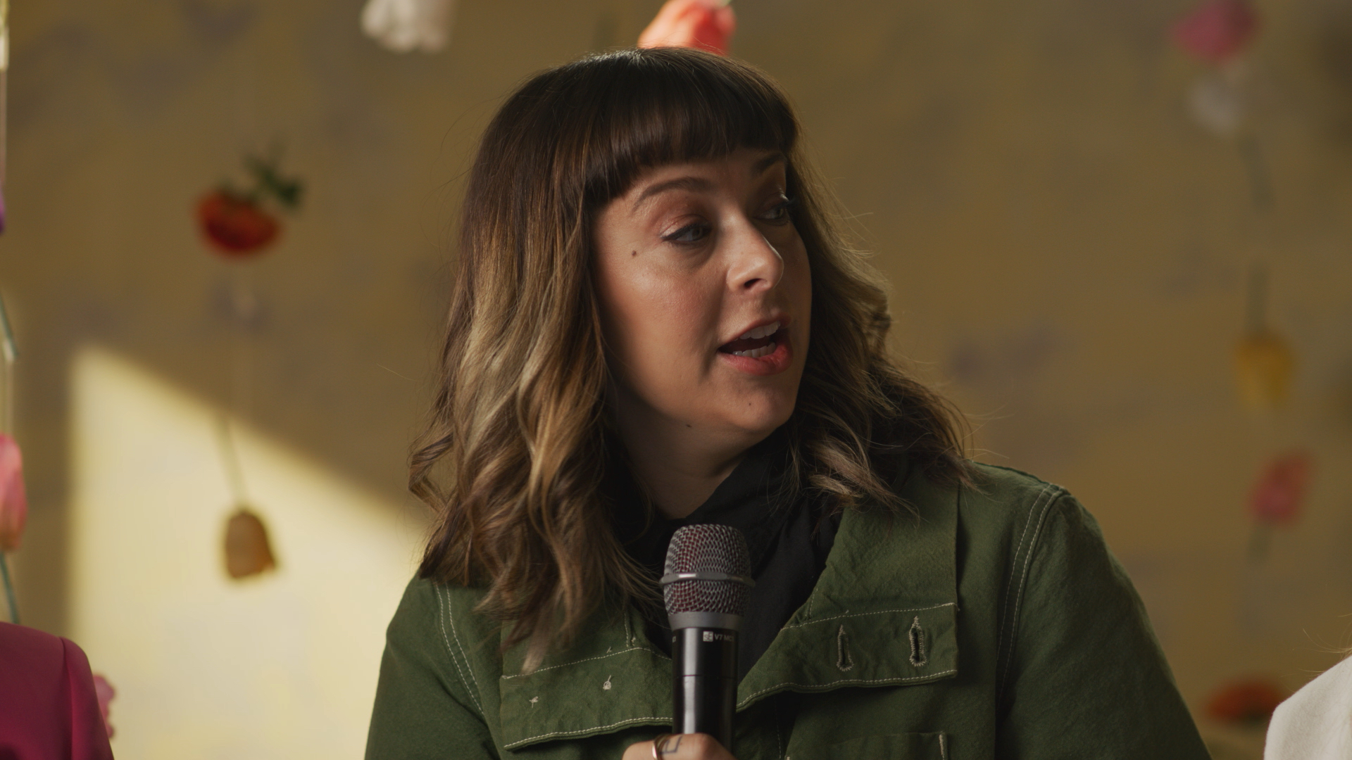
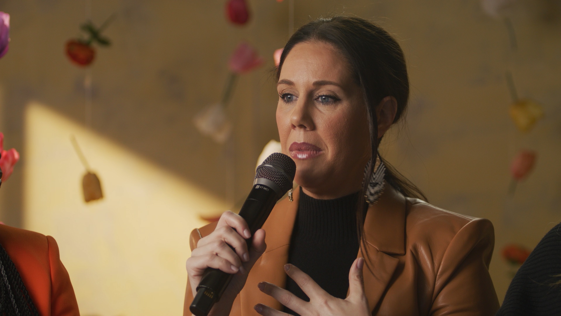
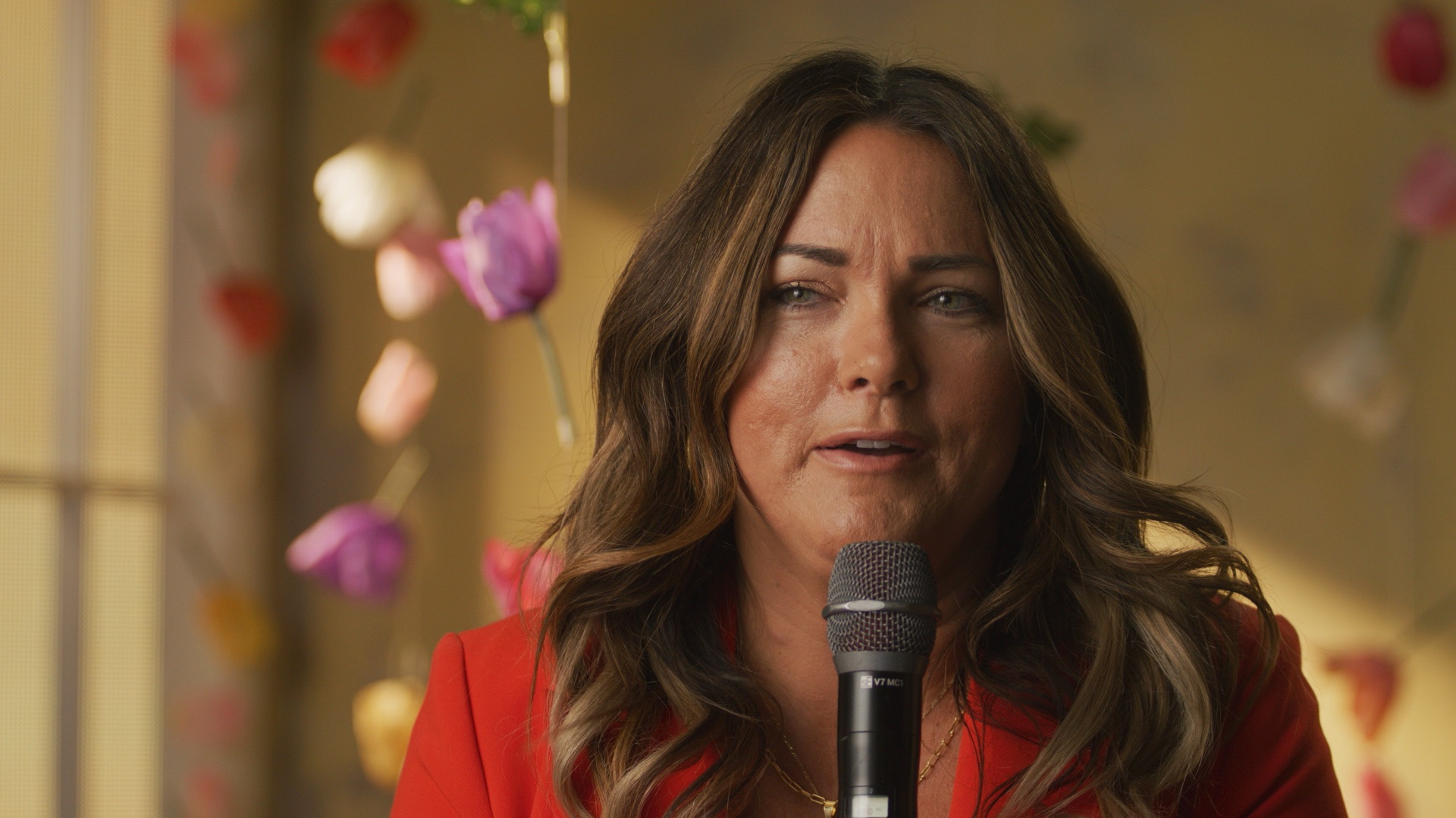
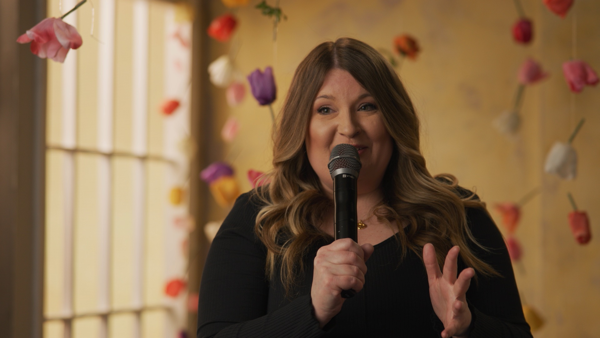
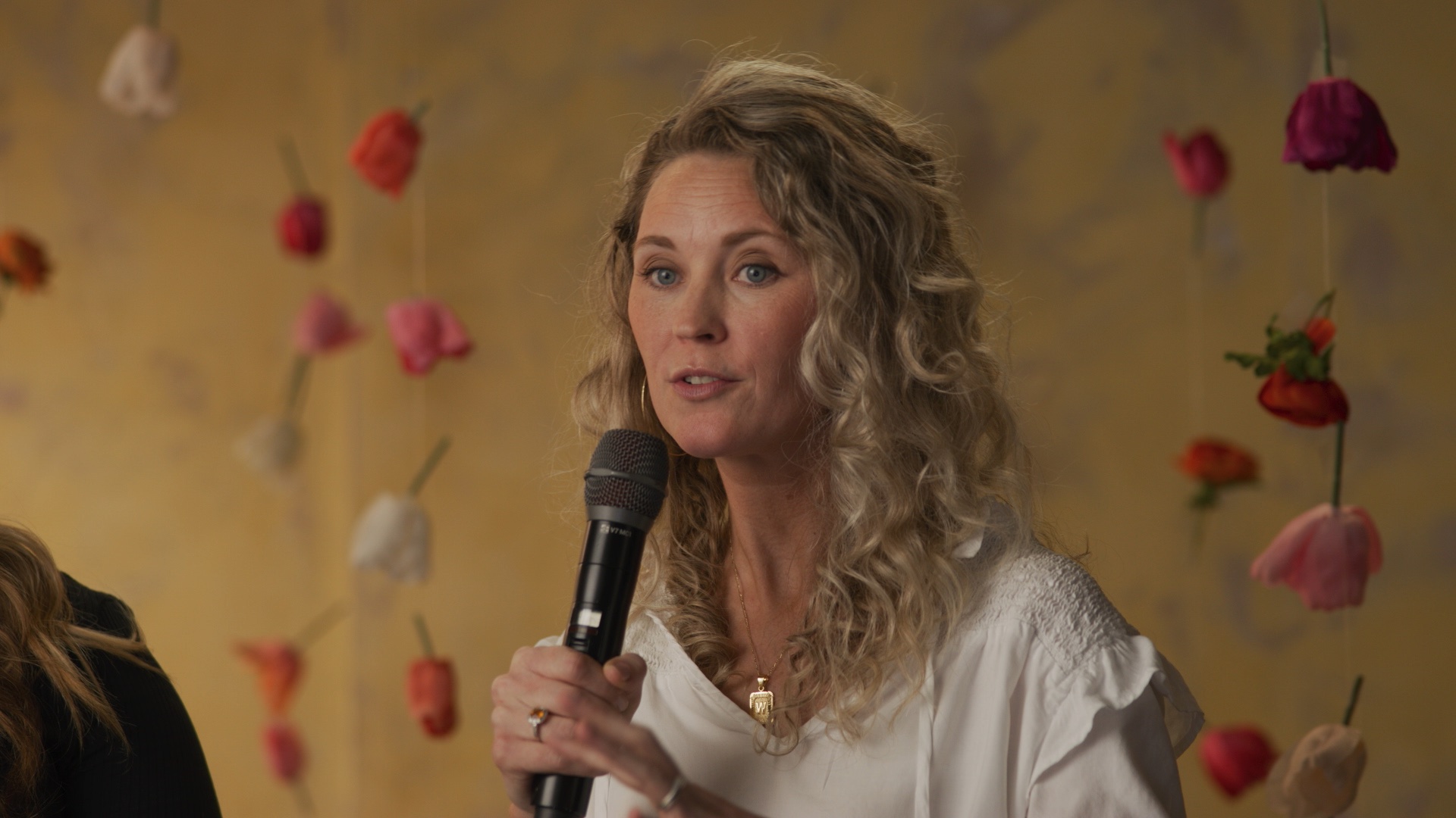
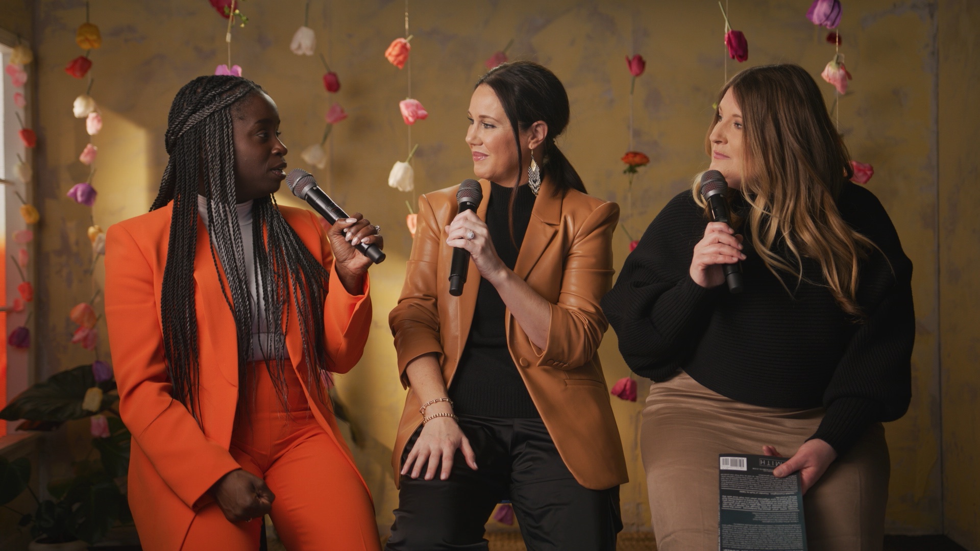
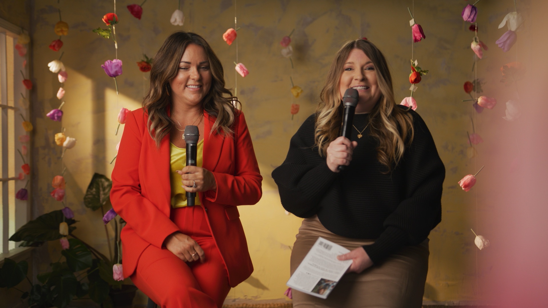
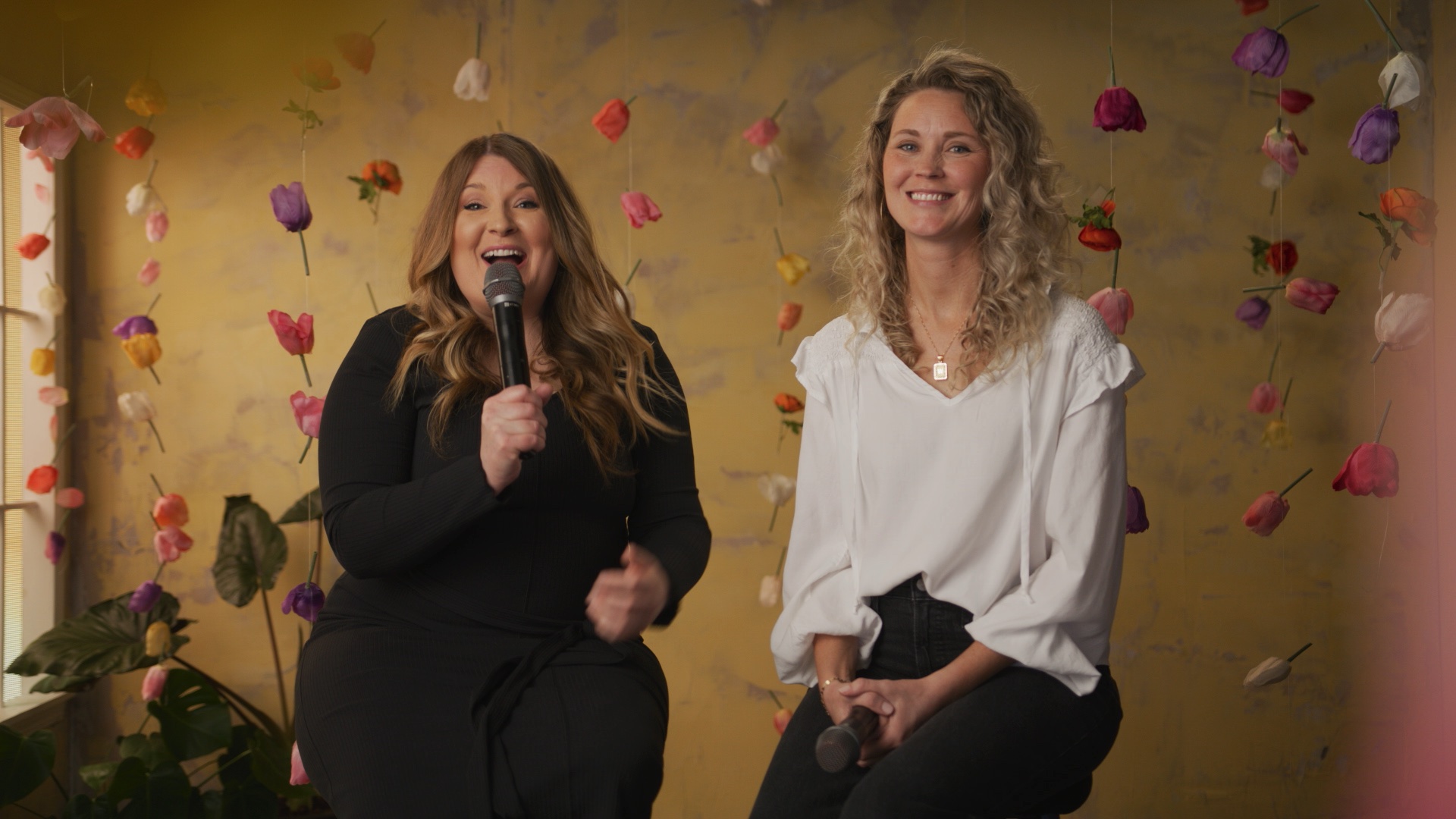
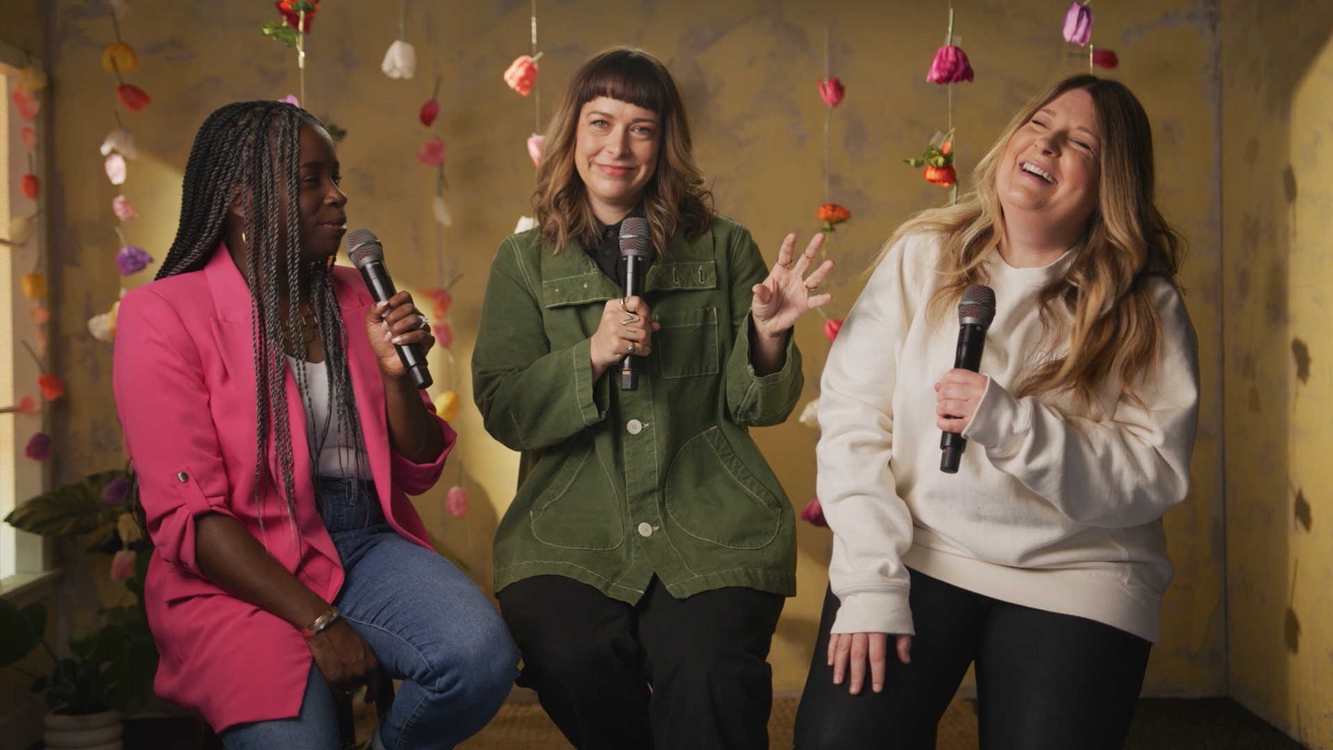
No cool BTS video for this conference, but we did do a cool set design.
Above, you can see screenshots of this wonderful and very feminine set design. We were really proud of how this turned out.
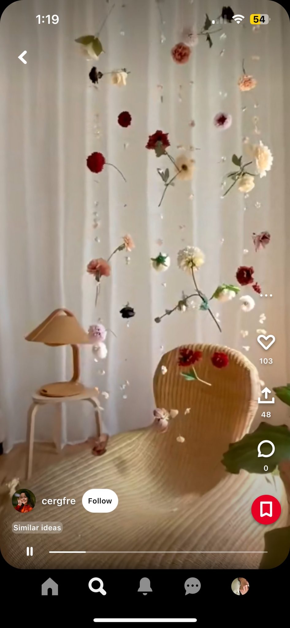
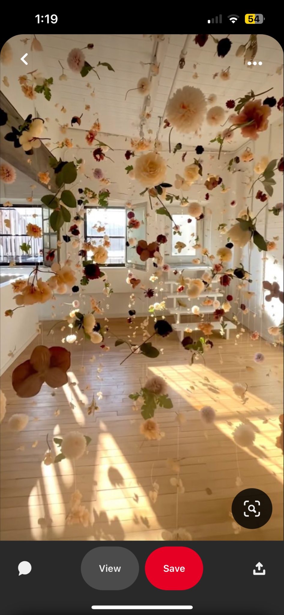
Inspiration
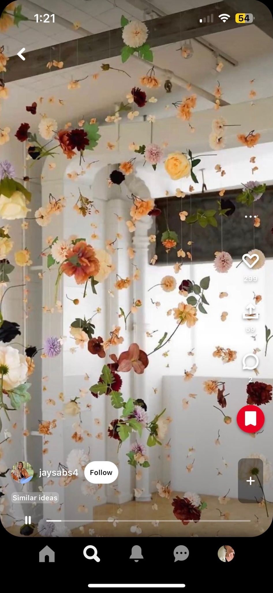
We wanted to utilize foreground and create a deeper depth of field then we normally get to do. Space is always challenging for us, so these hanging strands of flowers were a beautiful way to create depth and awesome bits of color. Here was the inspiration we pulled from.
Branding
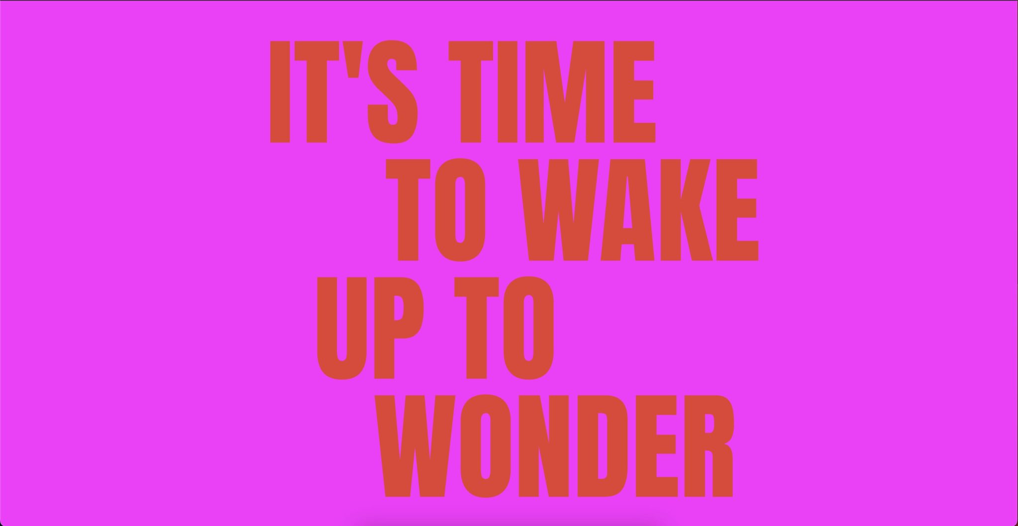
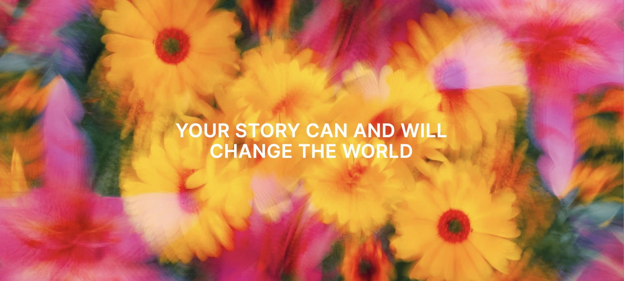
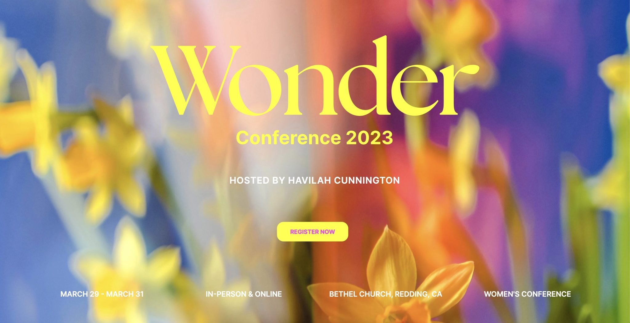
Notice on these set design pics, we landed really close. But also notice how we pulled inspiration from the branding for this event.
Behind the Build
Below you can see Nathan, Chase, Kelsey and Hunter testing the set and adjusting the lighting.
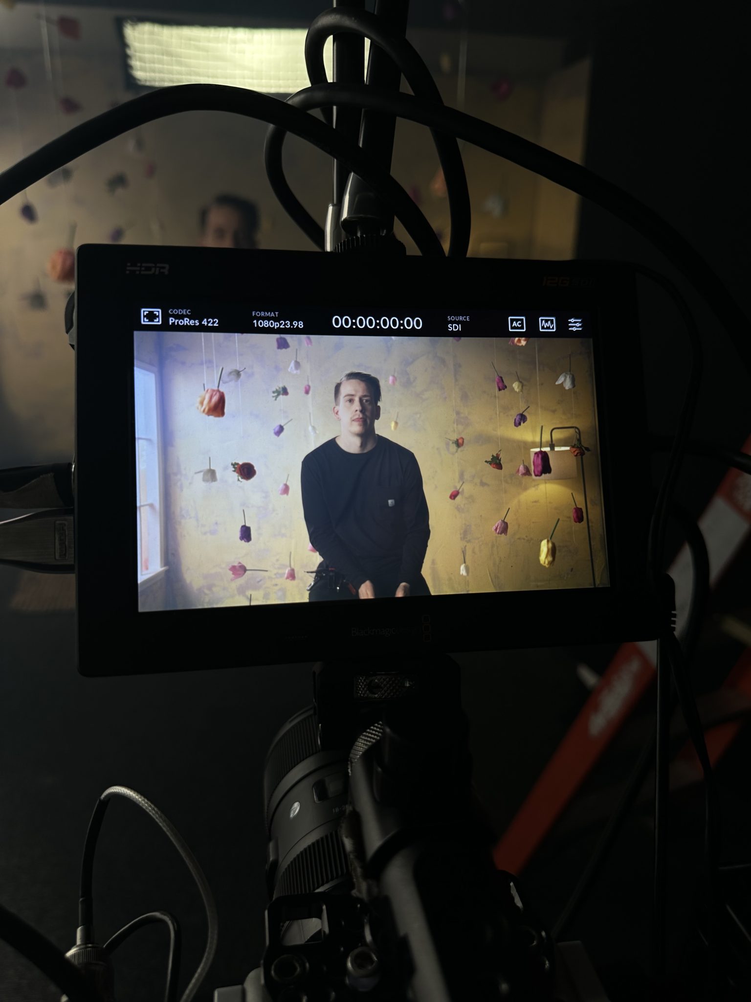
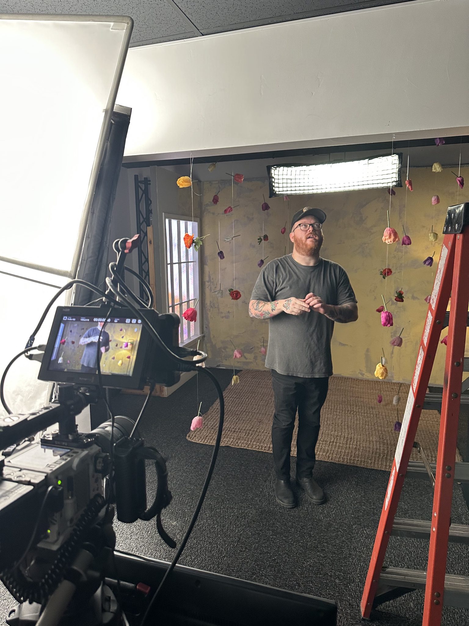
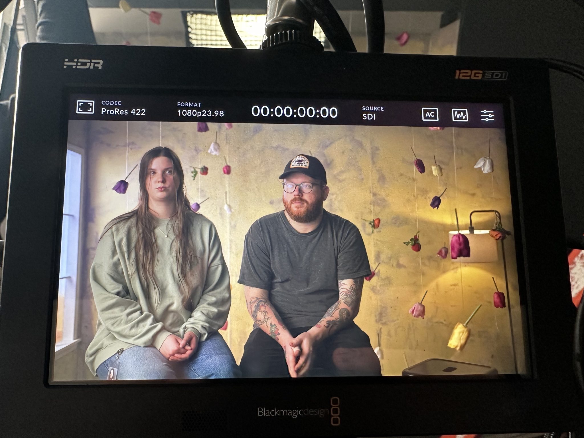
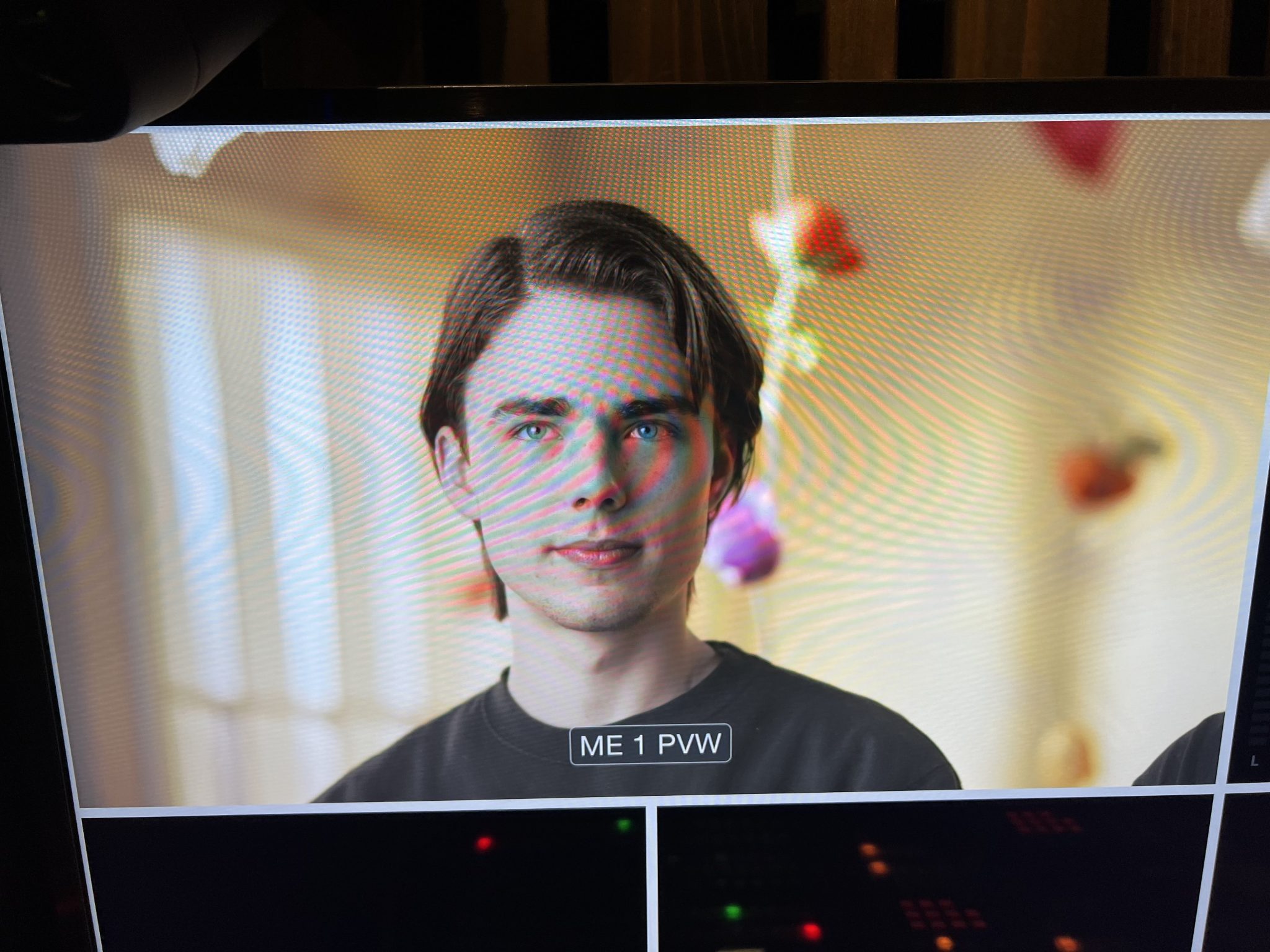
We were especially proud of the fake window and the light.
LED and the Window
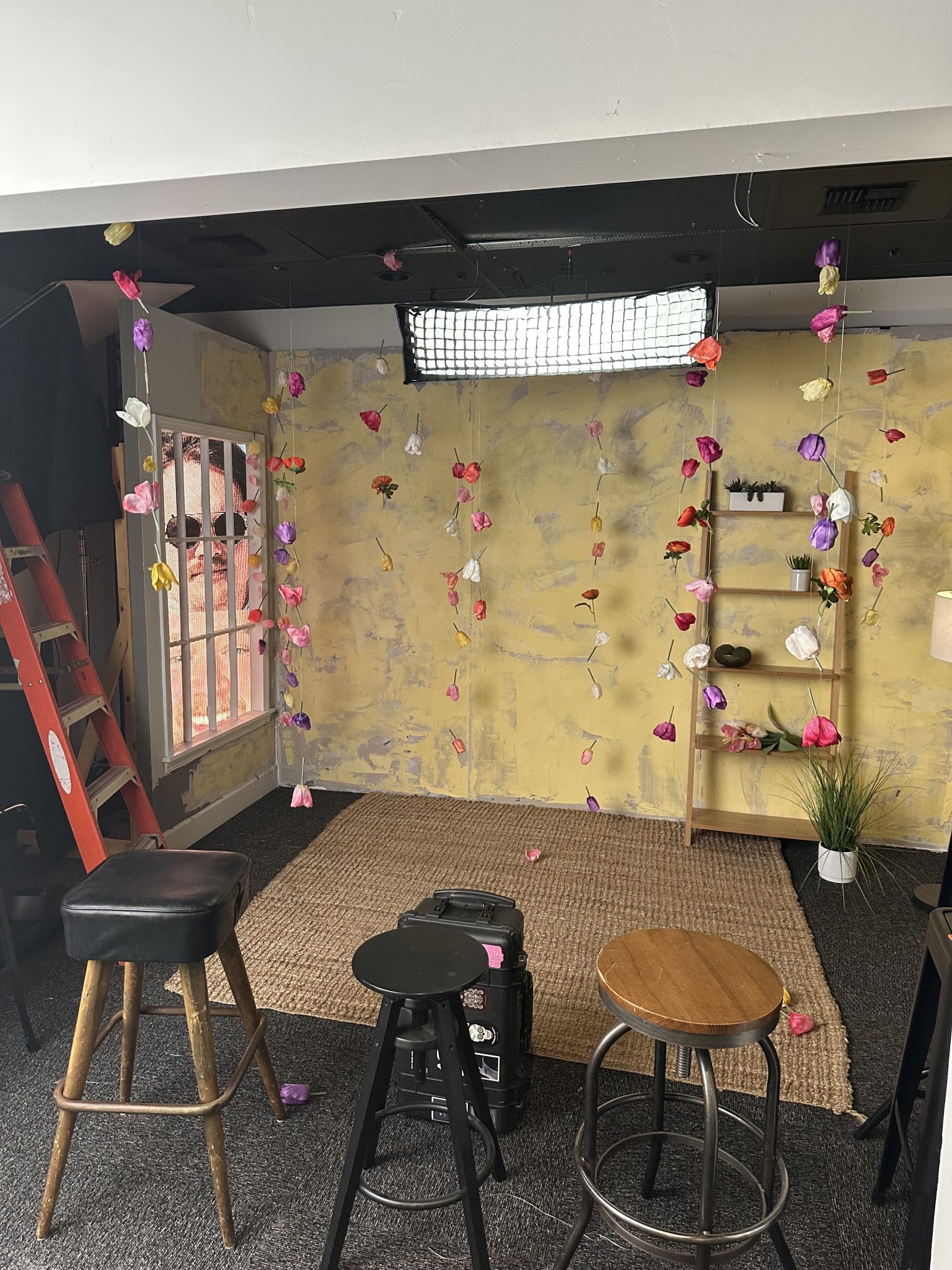
We wanted to do a window with a window light, but we also wanted to try something different. We had a few spare LED tiles and decided to fill the window with different images like sunrise, sunset etc. We thought this made for a really cool interactive element to the set. Also pictured are several stools. We tested 5 different design to find the right hight that would accamodate the talent and the various hight differences.
Again, we don’t every try to create “cool” set designs. We are looking to provoke an emotional connection and using a visual medium to do so. Let us know how we did!
