This may not be something that everyone will notice, but I’ve been pretty excited about this change. We have done over 5,000 worship sets since around summer of 2015 in Futura Medium, and this past Good Friday we launched our new lyric font, Roboto Bold.
Why the change? Our Production Manager, Blake Citro, asked me recently to analyze why we use the font we use, and not to just keep using it because we have been using it. Turns out we’ve been using Futura for awhile, and there wasn’t anything tying us to it, besides it looking fairly good.
I kind of hoped that we had been using Futura since the start of Bethel Church in 1952, but as I started to investigate, realized that that was just a personal dream of mine. The earliest sighting of a Bethel event using Futura that I could find, was on September 15, 2015 at a Bethel Music Worship Night in Akron, Ohio. Not as old as I had hoped, still over 300 Sundays of it though!
I looked at and compared what some other churches were doing for their lyric look, and I learned some things that I hadn’t even considered before, I’ll share that below. We ultimately settled on Roboto Bold, as it’s a font that our church has been using on their newer branding. It feels really good to match up with them, I’m glad we finally did it!
I analyzed the look of 12 churches, including our own, and below is the info I gathered. I’ve linked to youtube videos of their streams, along with links to the foundries where you can get more information. All the churches I looked at use Sans-Serif fonts, which I think is a great choice for the medium.
I did my best at guessing what fonts other churches used, they might be slightly off, but fairly close to my eye! If you notice something is off, contact me at: paul.fehr@bethel.com
It’s really interesting to see how similar other churches are, but still have definite small details (like the vertical alignment differences), each giving them their own flavour.
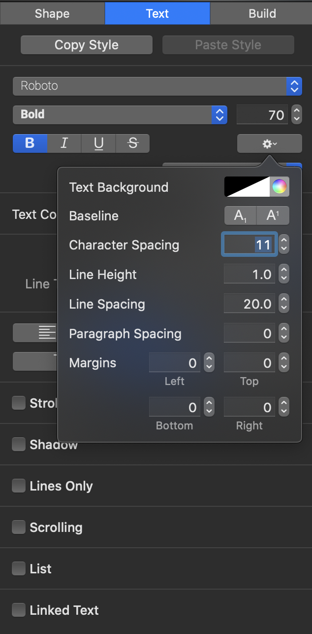
For those interested in our new specific ProPresenter font styling, I’ve included a screenshot for you guys.
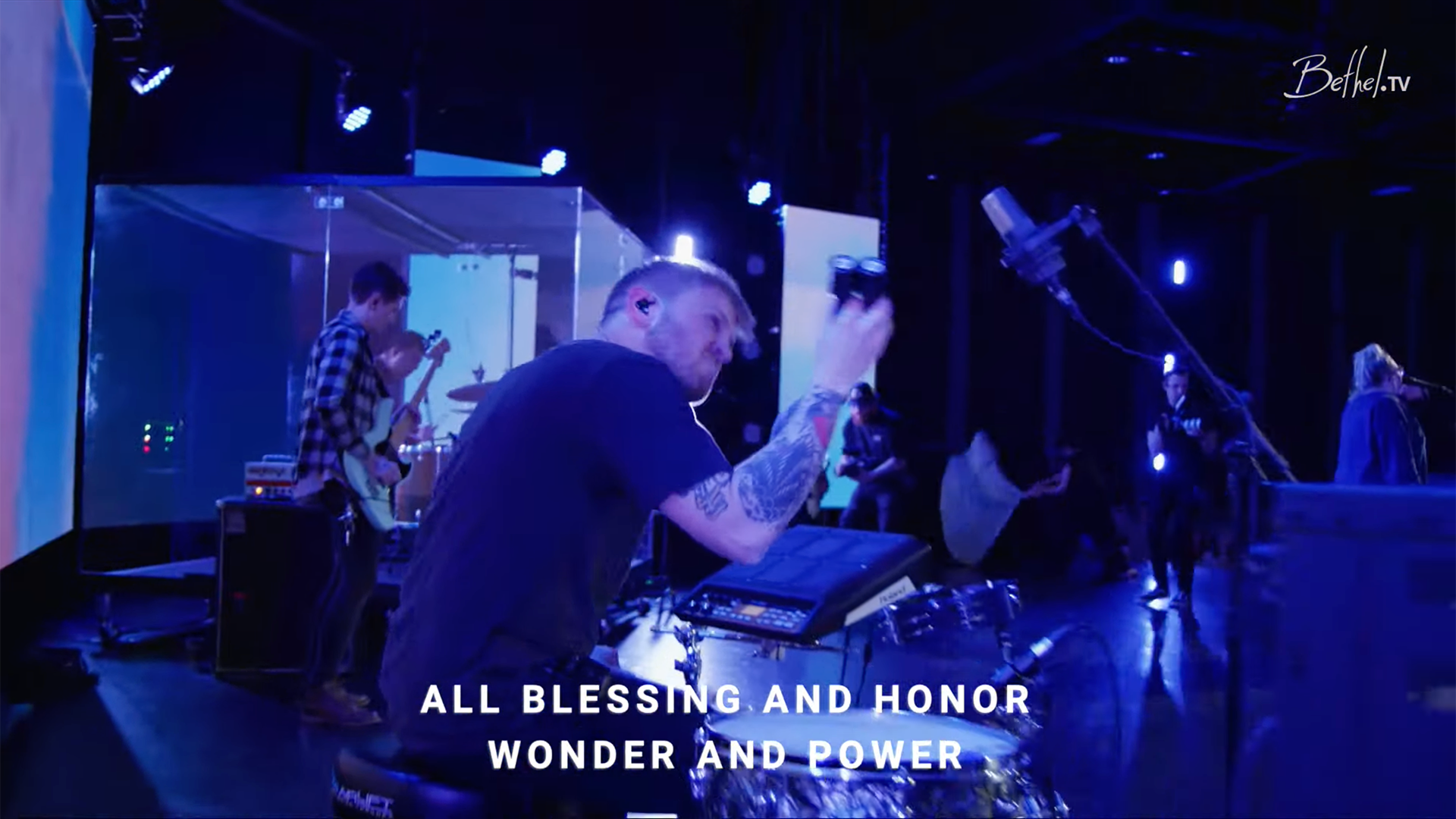
For now we’ll stick to our simple white, centered lyrics that only fade out. We also left the spacing very similar to what we had before, so it’s not a massive difference and it feels like it helps legibility. Let me know what you guys think!
8 replies on “New Font at Bethel”
Nice. We also match brand font, I really like the coherence of that.
Thank you for this detailed information! I love the chart of different font usages in the wild.
The amount of Helvetica surprised me!
Thanks for the information.. But I can’t find the Roboto font… Thank you
Hey Alex!
Here is the link to Roboto, its a free font:
https://fonts.google.com/specimen/Roboto
🔥🔥🔥
I love the new font, but Futura still my fave. When we see Futura first thing that comes to mind is Bethel Church – top of mind.
I always loved Futura for Bethel’s lyrics. When the time came for my church to hop online, I looked into what others have been doing and all caps Futura in a somewhat medium weight looked clean, very legible and just beautiful enough to not be bland, but never distracting (thanks to the all caps).
One thing I noticed was that the simple white works mostly because of the fantastic video quality with enough dynamic range to not blow out highlights. With whatever color correction you guys do, “white” areas in the footage never threaten the lyrics. I gotta say, that’s pretty cool. 🙂
Thanks for taking the time to write an article about your decision process and sharing some details!